Re-branding for the Swiss Lejon watch.
As we are talking about a branding of a watch it is really important that all the elements suggest perfection, precision and great care for the details – that’s why it had to redesign of the logo.
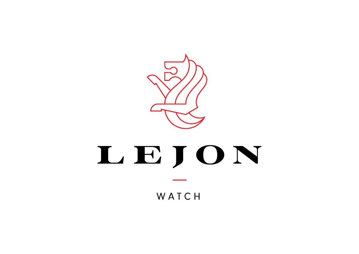
I completely re-drew the letters to be more precise and sharp. There is a great balance in the design now – the letter J is parallel with the lion’s elbow, the icon’s stroke is the same width as the letters’ feet.
The lion icon didn’t have an unified look either – it was also not easily recognizable. That’s why I simplified it, made it more stronger and more unequivocal.
The strong use of red would work very nice because of the Swiss background.
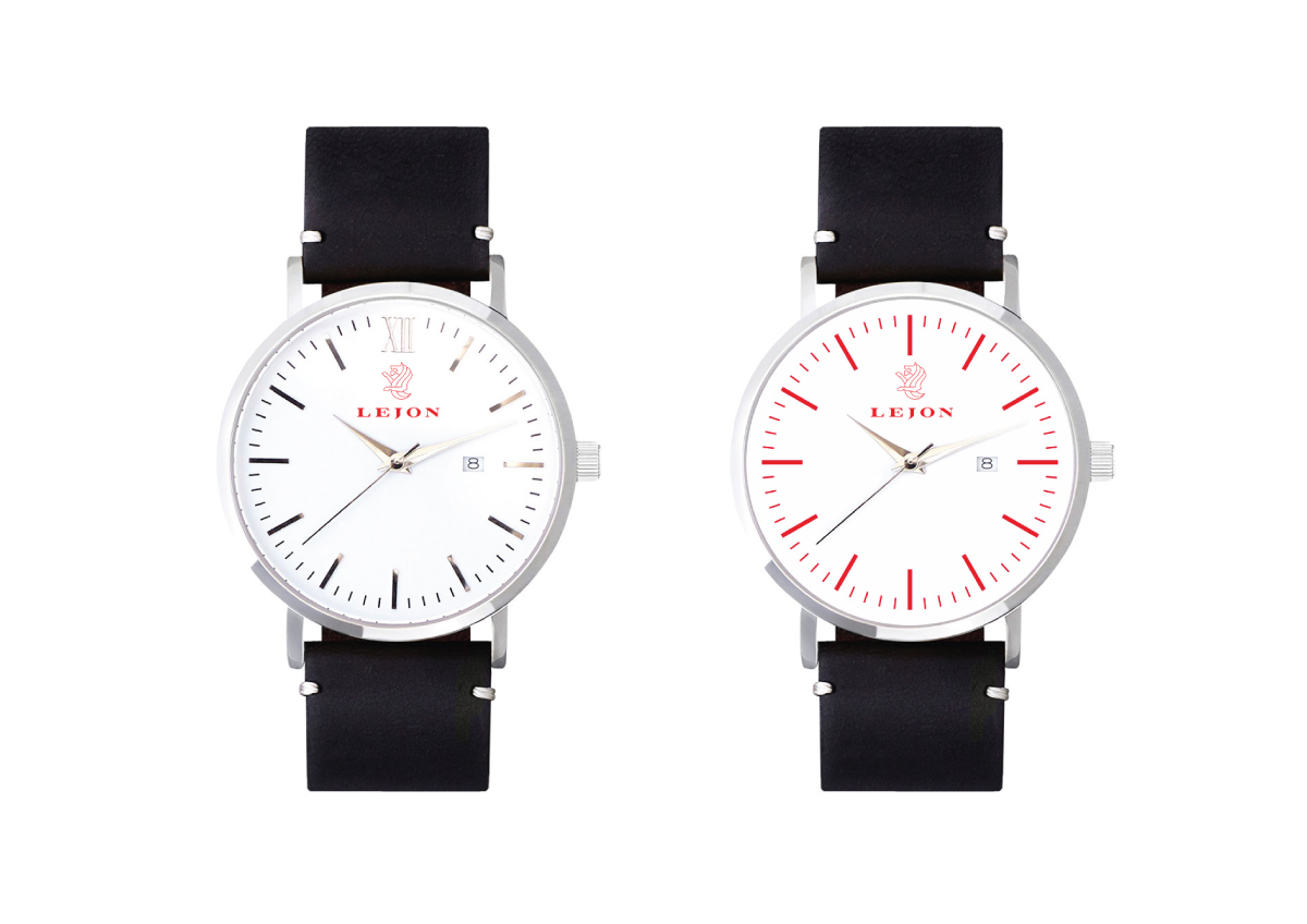
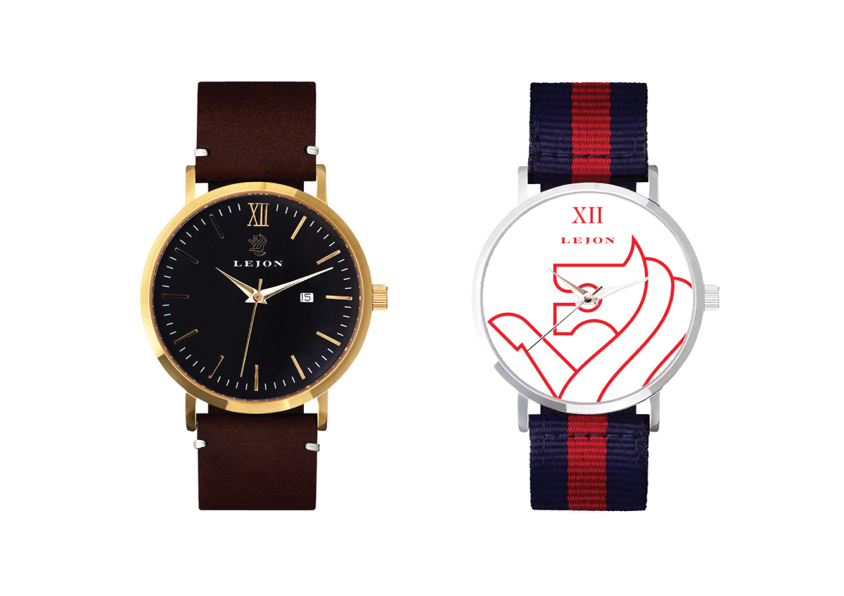
The watch mock-ups can be clearly seen that with the new logo the brand itself became more visible and stronger.
This is just a concept, because the owners stick to the original logo and icon, so I had not accepted the job.
You can see the original branding in here: lejonwatch.com
The original logo.

The redesigned logo





JOIN ME ON FACEBOOK ------› www.facebook.com/kissmiklosdotcom
...if you get a chance.
...if you get a chance.


